
Good Morrow Tavern
THE INSPIRATION
Some projects are exciting because they're creatively challenging. Others are exciting because they're personal. Good Morrow Tavern was both.
I've known the Kingston family for several years, and we gather around the table each month for a game of Dungeons & Dragons. So when they approached me about creating the brand for their D&D-themed tavern, it was an easy "yes." Having the chance to help bring a world I already loved to life made this project especially meaningful.
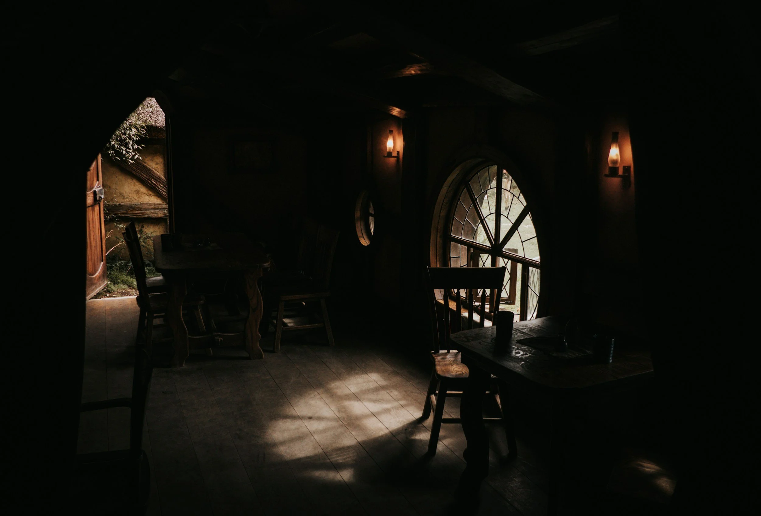
From crafting the logo and developing the color palette to producing the promotional video, every element was designed to capture the warmth of a welcoming tavern, the spirit of adventure, and the imagination that makes tabletop games unforgettable. Scroll down to explore the branding and see how Good Morrow Tavern came to life.
DRAGONS GOLD
#D8B24A
TAUROS HIDE
#412513
OBSIDIAN DUNGEON
#1E1716
PROFESSORS QUILL
#F7F1DE
VIRDIAN GUILD
#26372F
CHARIZARD EMBER
#531223
THE PRIMARY LOGO
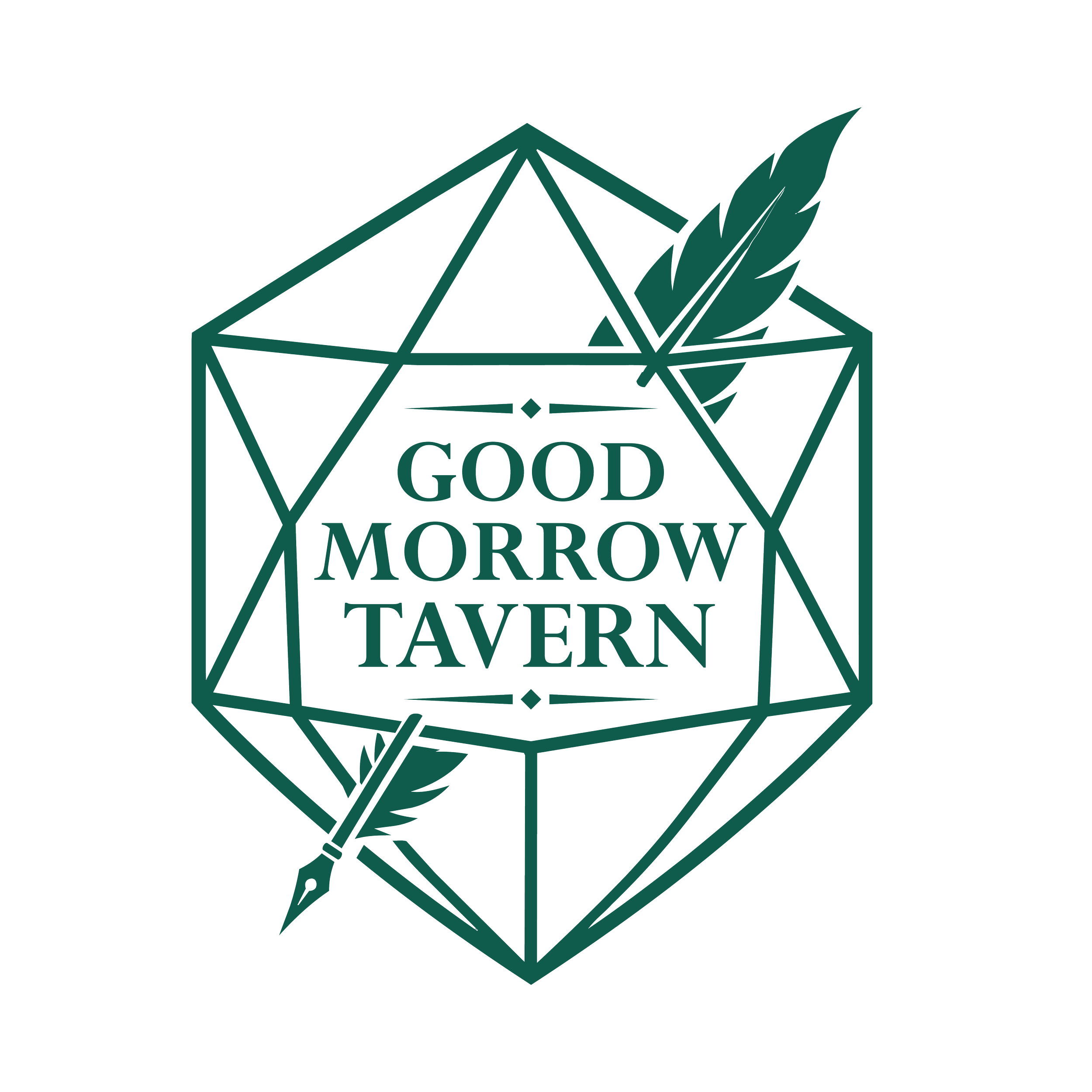
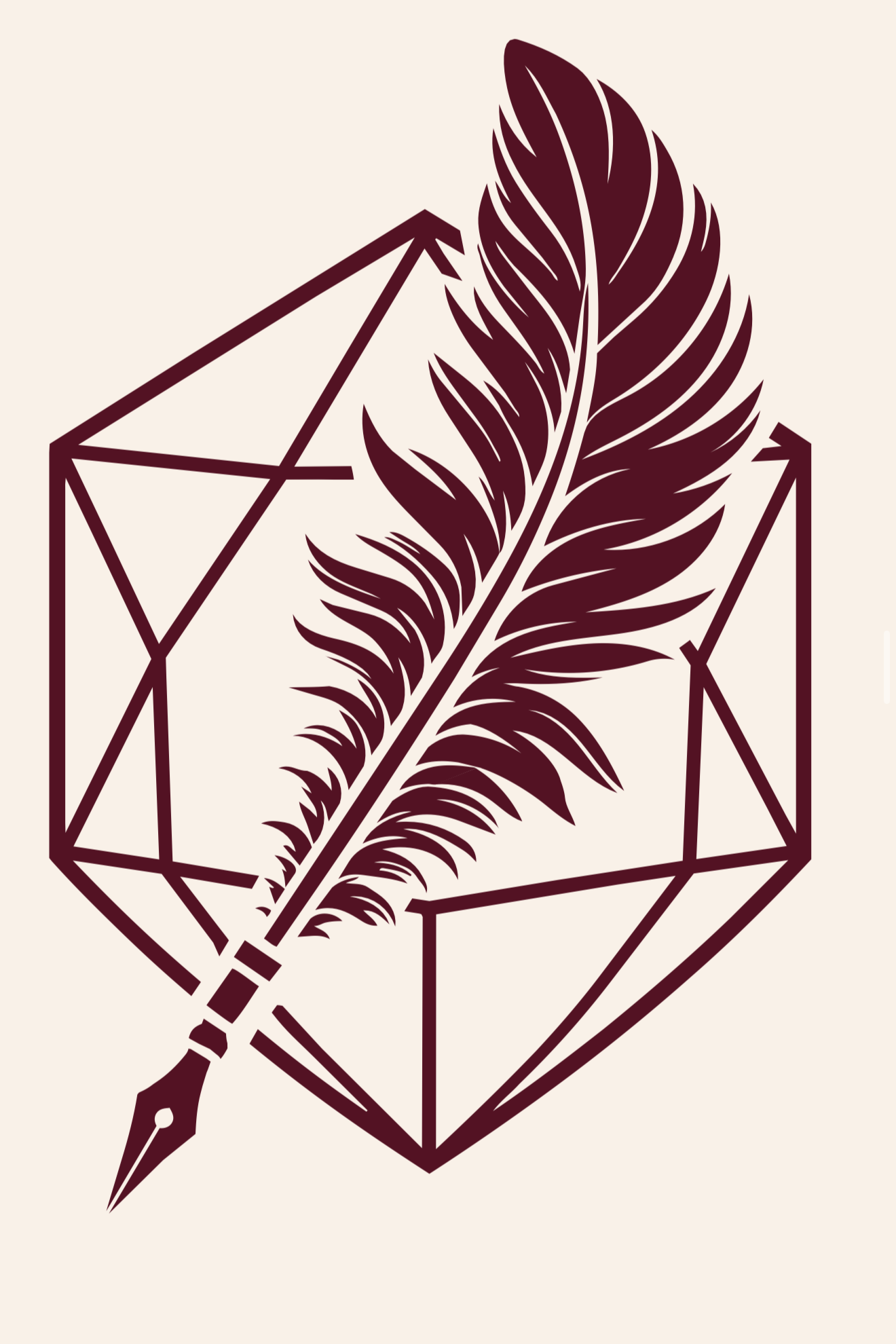
The goal for this logo was to seamlessly blend two defining elements of the Good Morrow Tavern brand: the world of Dungeons & Dragons and the art of storytelling. The foundation of the mark is built from the silhouette of a 20-sided die (d20), an iconic symbol within the D&D community. Woven through the geometric lines of the die is a quill feather, creating a sense of unity between adventure and the stories that bring it to life. By integrating the feather directly into the framework of the d20, the logo becomes a single, cohesive mark that reflects the interconnected nature of imagination, community, and tabletop gaming.
THE SECONDARY LOGO
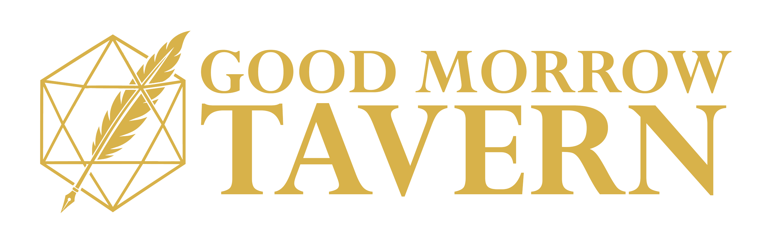
To complement the primary logo, I developed a secondary mark with a horizontal layout for applications where a wider format was more practical. This variation maintains the core visual identity while introducing a refined feather illustration that adds distinction without sacrificing brand recognition. The result is a flexible logo system that can adapt seamlessly across signage, merchandise, social media, and digital applications while remaining unmistakably Good Morrow Tavern.

THE FAVICON
A strong brand should remain recognizable at every scale, so I created a simplified favicon that distills the identity into its most essential elements. By reducing the design while preserving the signature d20 silhouette and quill motif, the icon stays clear, memorable, and instantly identifiable across browser tabs, social media profiles, merchandise, and other small-format applications.
The Tavern Awakens
To bring the brand to life beyond static visuals, I created a promotional logo reveal that captures the atmosphere and personality of Good Morrow Tavern. The animation unveils the mark against a weathered stone backdrop, surrounded by flickering fire, drifting embers, and glowing sparks—evoking the warmth of a bustling tavern and the epic adventures that begin around the table. Every visual element was chosen to reinforce the brand's immersive fantasy aesthetic, transforming the logo into an experience that feels as memorable as the stories waiting to be told.